Index
Role
Duration
Platform
Tools


Encourage daily engagement without cognitive overload
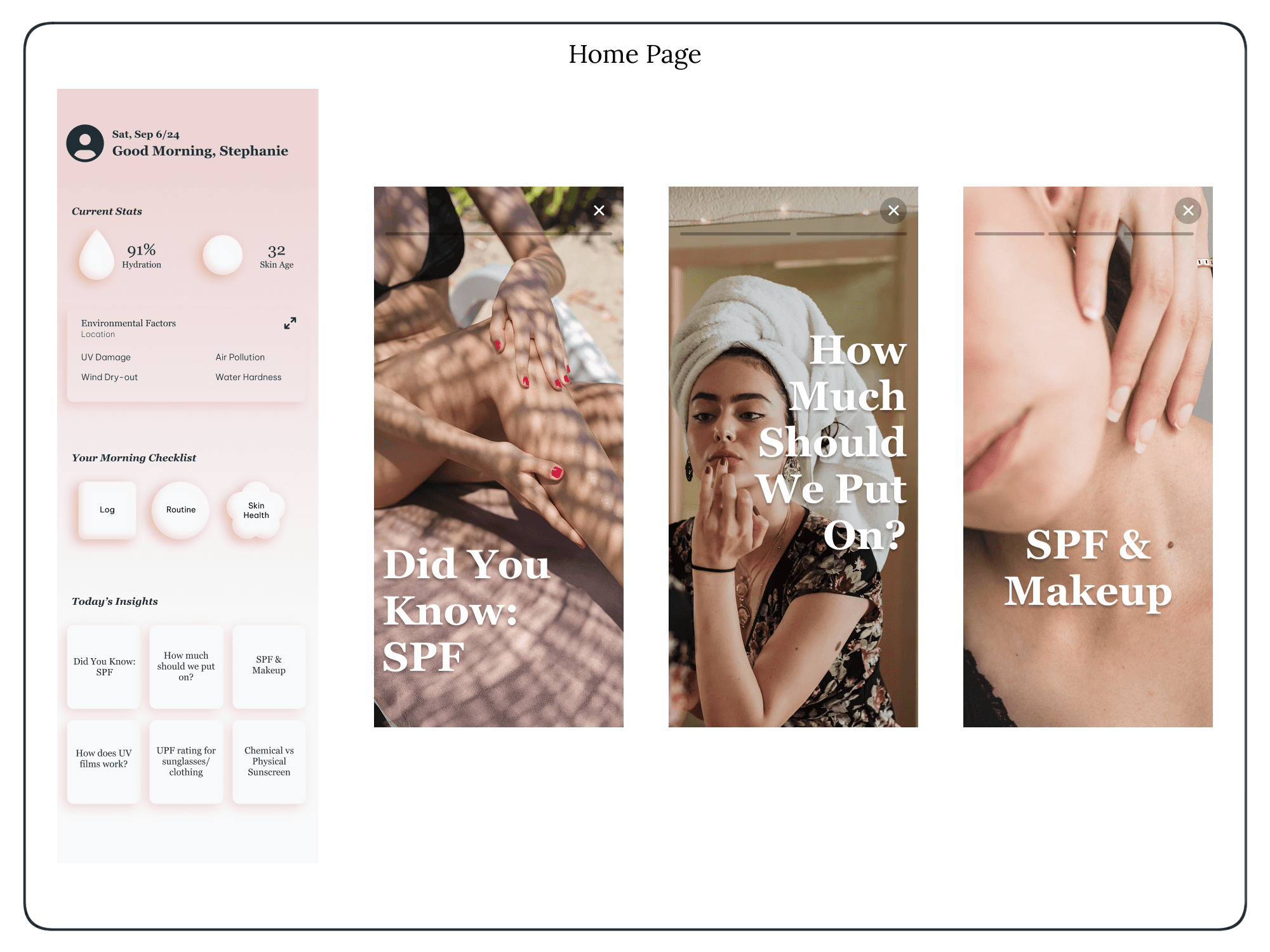
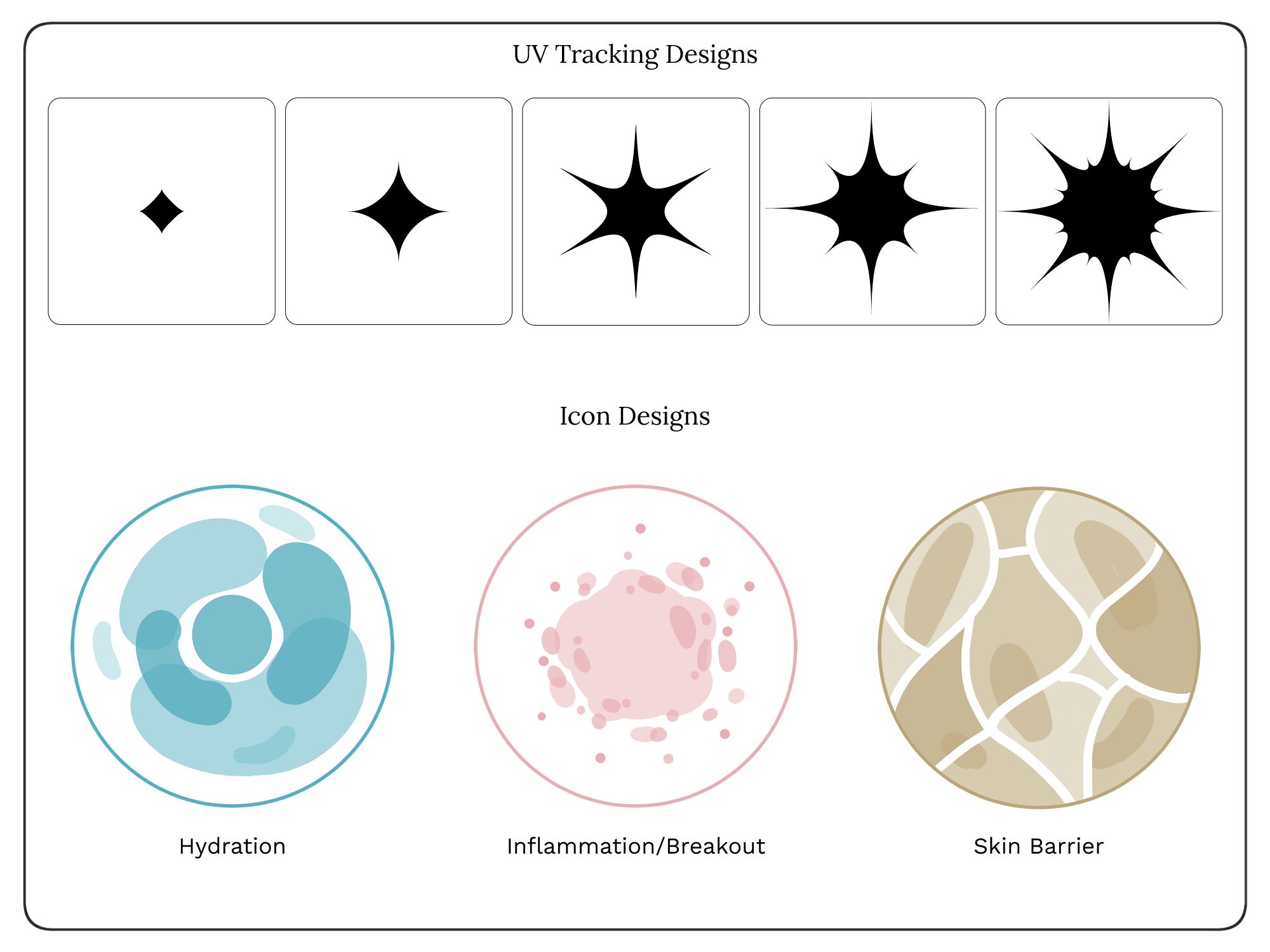
Make progress easy to understand at a glance
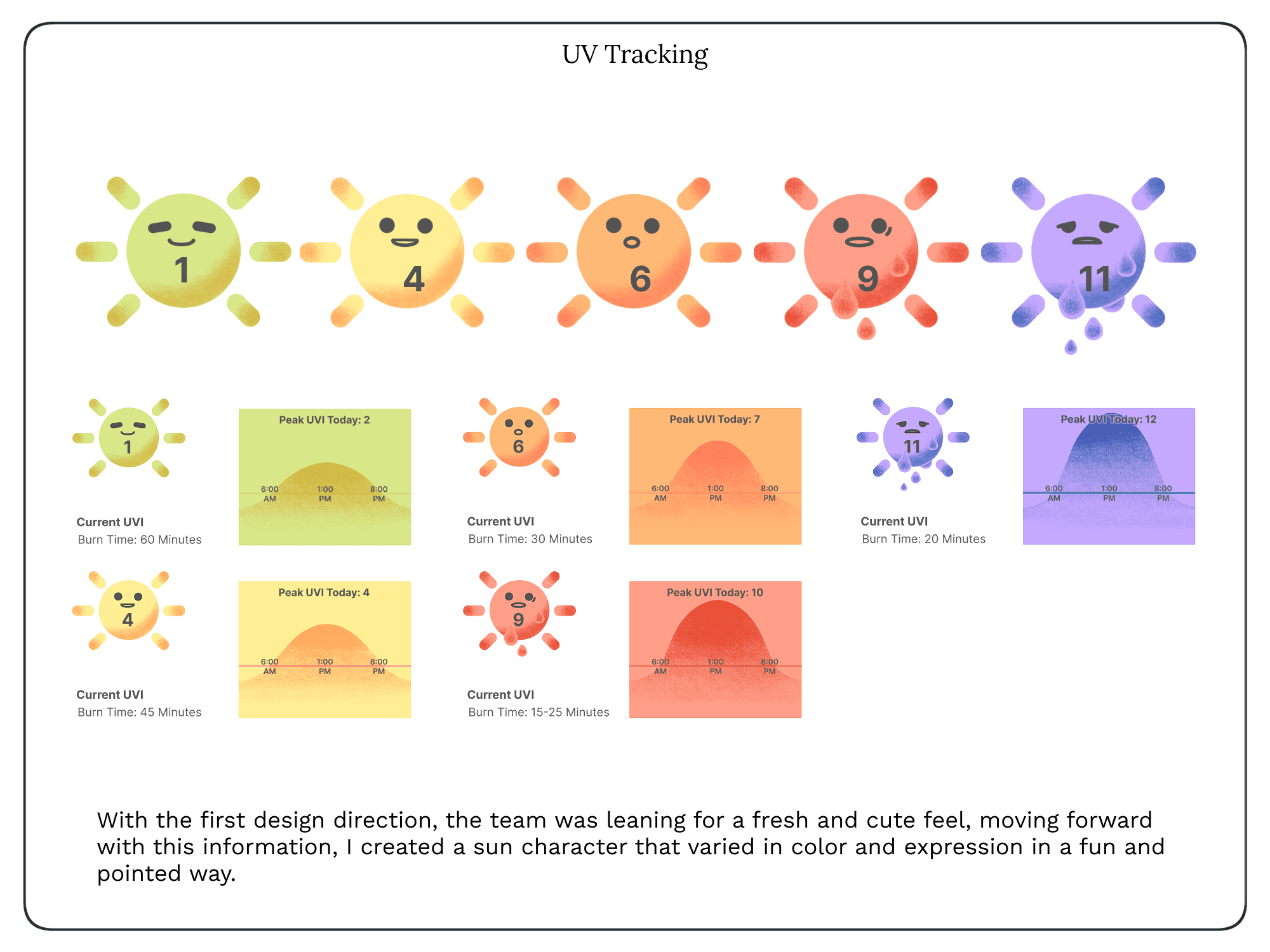
Create a visually motivating experience
Goals
Early-stage product with evolving requirements
Limited development resources
Need for scalable UI patterns
Constraints
1
Users wanted positive reinforcement, not guilt-based tracking
2
Visual feedback increased motivation more than text
3
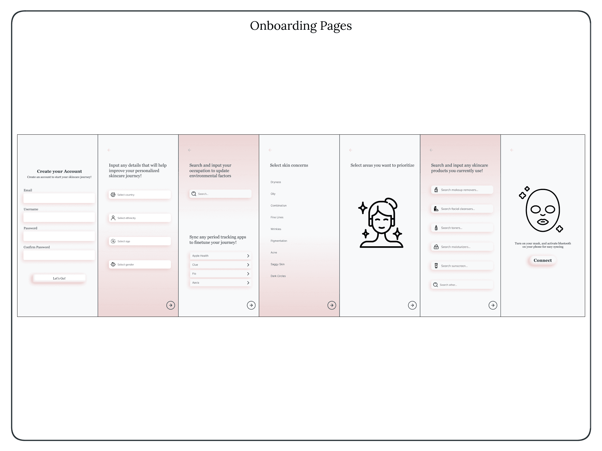
Too many choices caused drop-off
These insights directly informed simplified flows and visual-first interactions.

A closer look & more
Final Solutions

A closer look & more
Results and Takeaways
As the Morphace project continues to evolve, I’ve had the opportunity to refine and enhance my approach to UX/UI, illustration, and animation. Building on the initial research and design work, I’ve focused on improving user engagement through more intuitive interactions, streamlined onboarding, and refined visual elements. Iterating on previous designs based on user feedback has reinforced the importance of adaptability and continuous learning in the design process. Additionally, as the product moves closer to launch, collaborating with developers and stakeholders has deepened my understanding of technical feasibility and real-world implementation. This experience has not only strengthened my problem-solving skills but also reaffirmed my passion for creating user-centred designs that seamlessly blend functionality and aesthetics.